
LGT BANK – POLARIS DESIGN SYSTEM
Enterprise Design System Development
Collaborative development of a modular, SAP Fiori–based design system (“Polaris”) to support internal web platforms and business applications within LGT Bank.
Project Scope
Role: UX/UI Designer (Design System Team)
Scope: Component Design · SAP Fiori Adaptation · Visual Identity · Documentation Framework · Cross-functional Collaboration
My Contribution
• Naming & visual identity for “Polaris”
• Logo concept and branding exploration
• Visual system refinement and theming
• Component design & Figma library contribution
• Fiori pattern mapping
• Co-authoring the “How to Use Polaris” manual
• Contribution to documentation structure in Confluence
Project Context
LGT aimed to standardise UI patterns across internal platforms while aligning with SAP Fiori standards and existing technical architecture.
The initiative required cross-functional collaboration between UX, development, and management — with evolving scope and internal restructuring during the project.
Collaboration & Delivery Model
• Agile setup with biweekly sprints
• Jira-based backlog & epics
• Confluence documentation
• Cross-team alignment (UX, Dev, Architecture, Management)
• Incremental rollout across web platform initiatives
Product Challenges
The old Arnette site was not an eCommerce website
The website did not appeal to Gen Z
The product purchase was very complicated
Not all products were sustainable
The social media profile and the website didn't correspond with each other
Project Objectives
Adapt SAP Fiori stencils to LGT-specific requirements
Build a scalable Figma component library
Establish documentation standards and usage guidelines
Align design, development, and governance
Support rollout across multiple workstreams
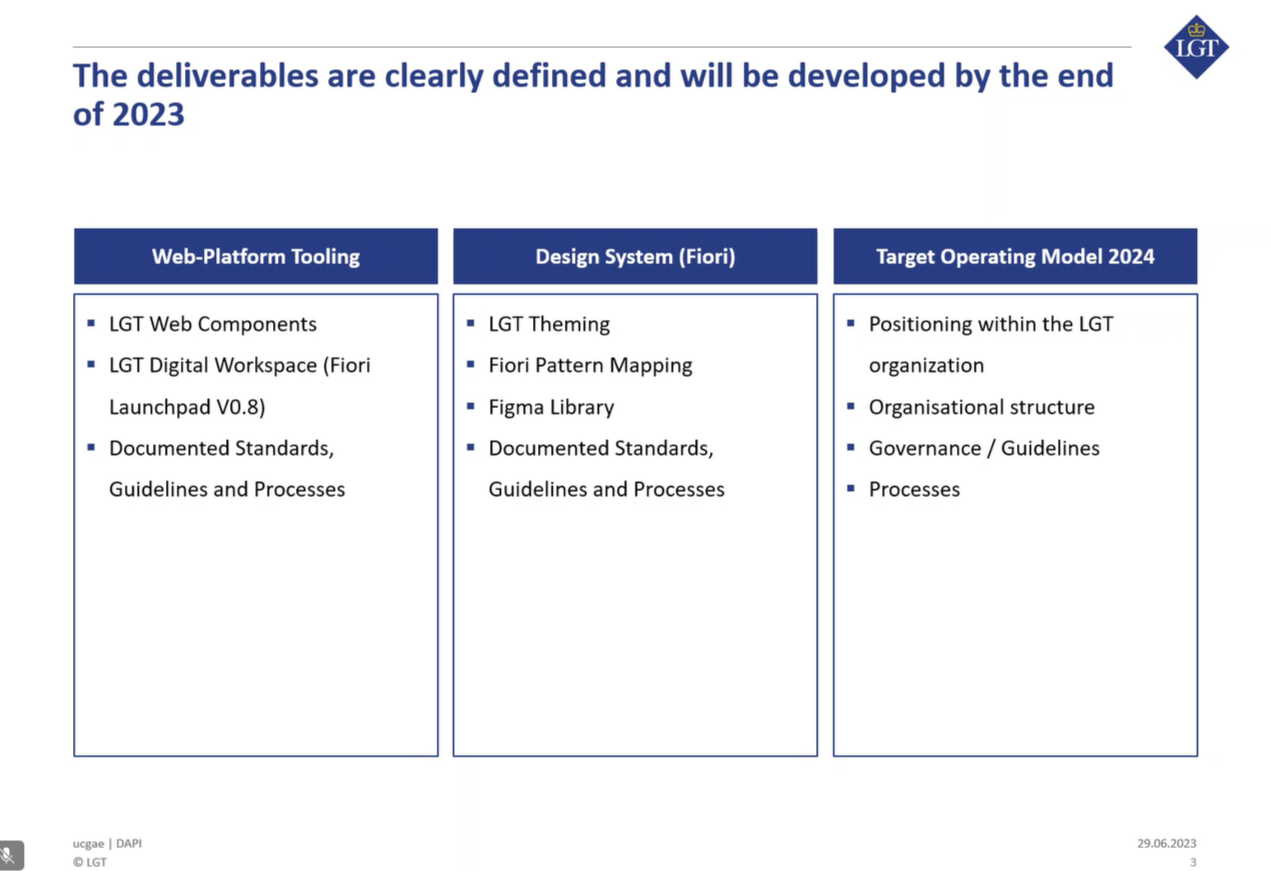
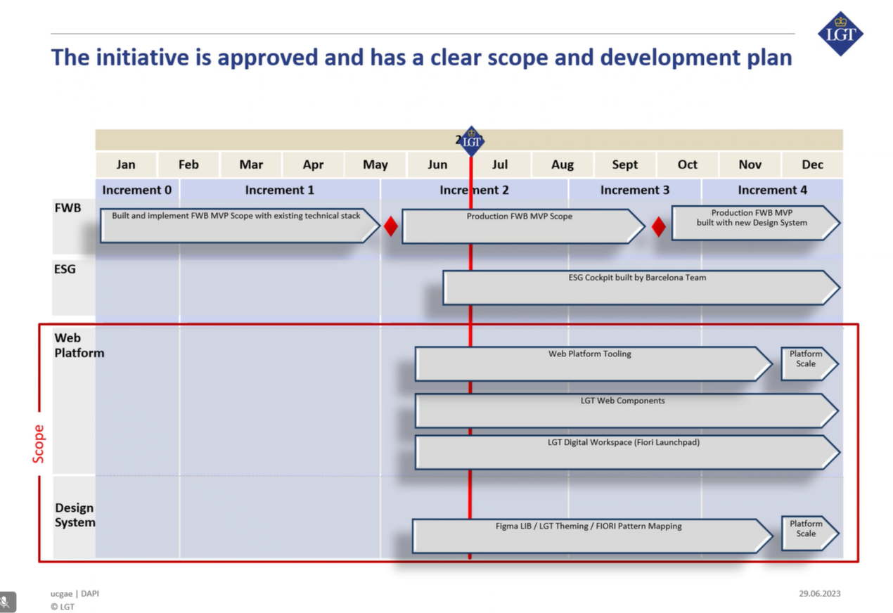
Deliverables & Timeline
The initiative defined a structured rollout across web platform tooling and a modular SAP Fiori–based design system. Deliverables included theming, pattern mapping, Figma library setup, and documentation standards — aligned with LGT’s internal governance model and development roadmap.
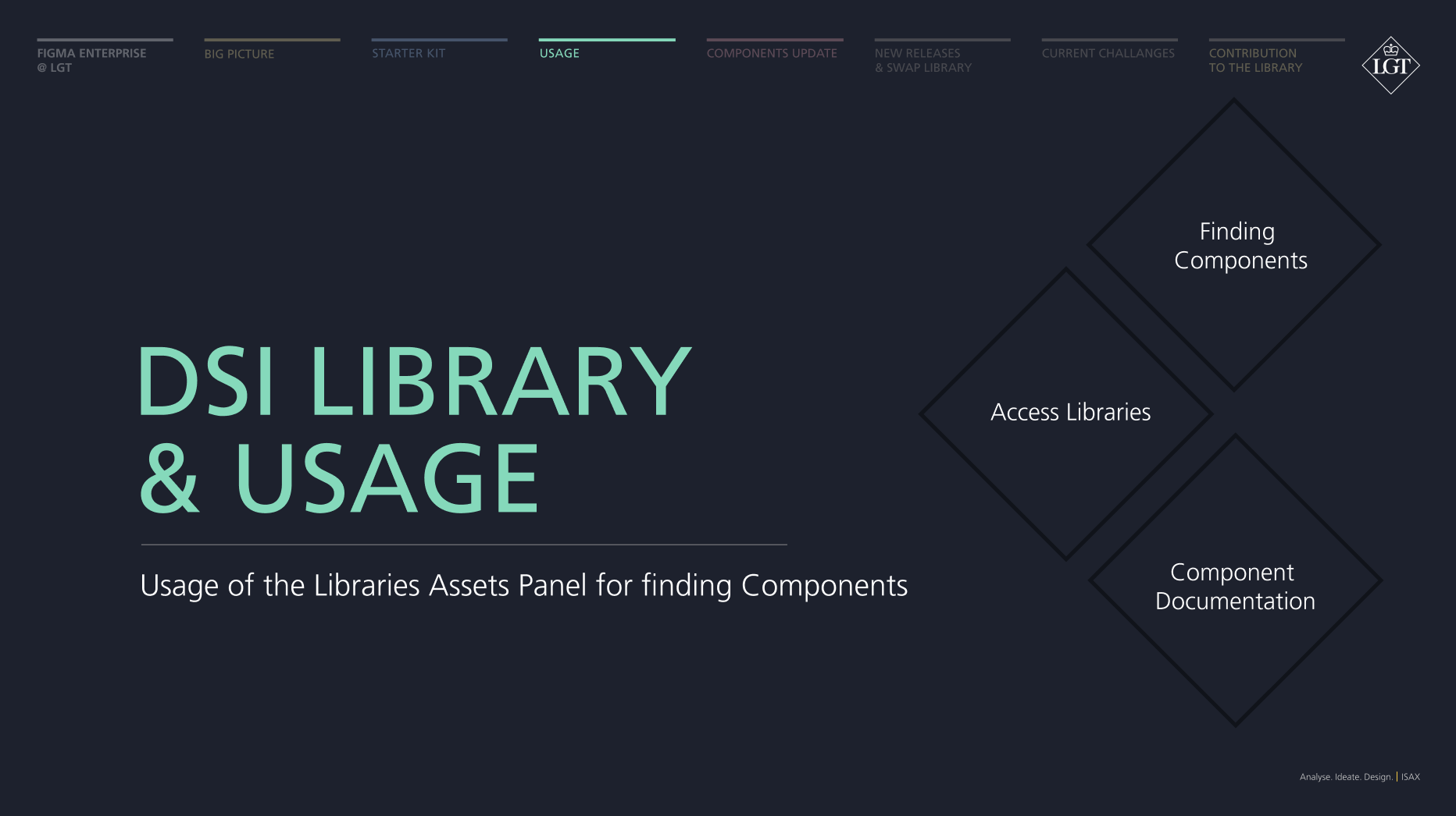
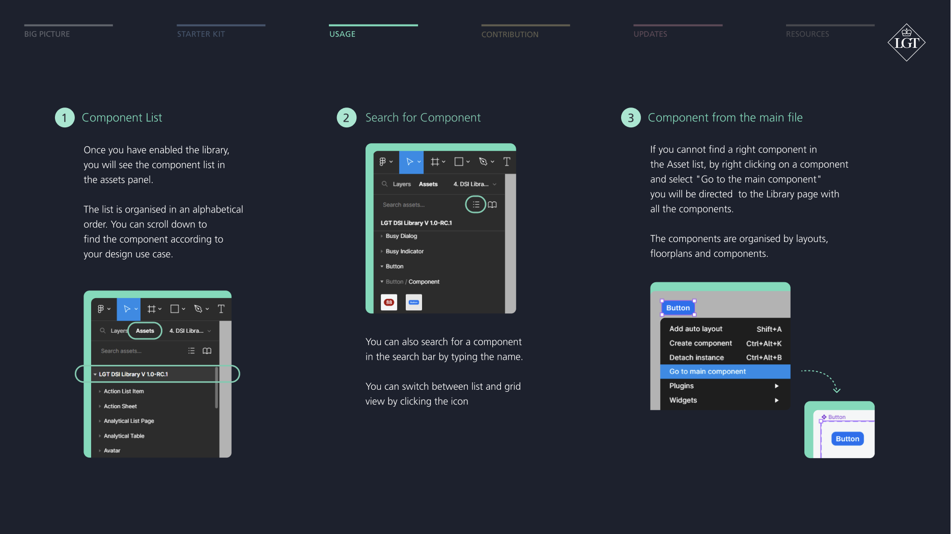
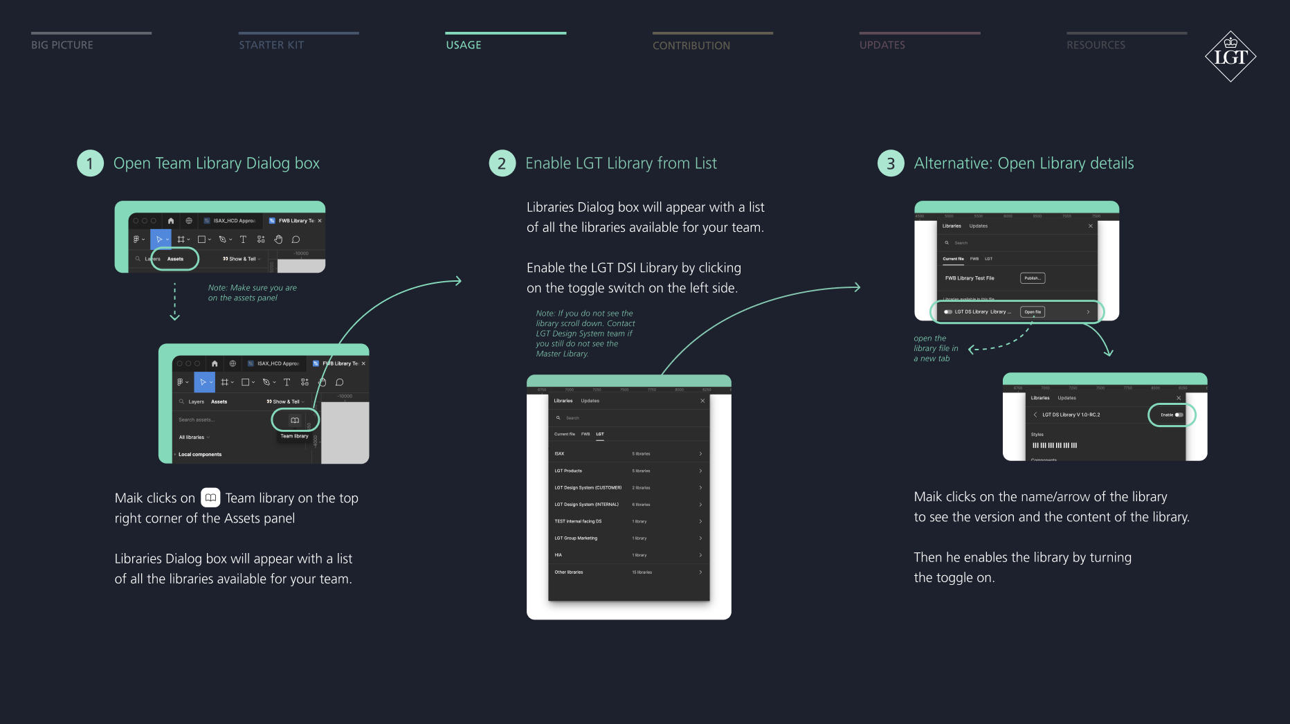
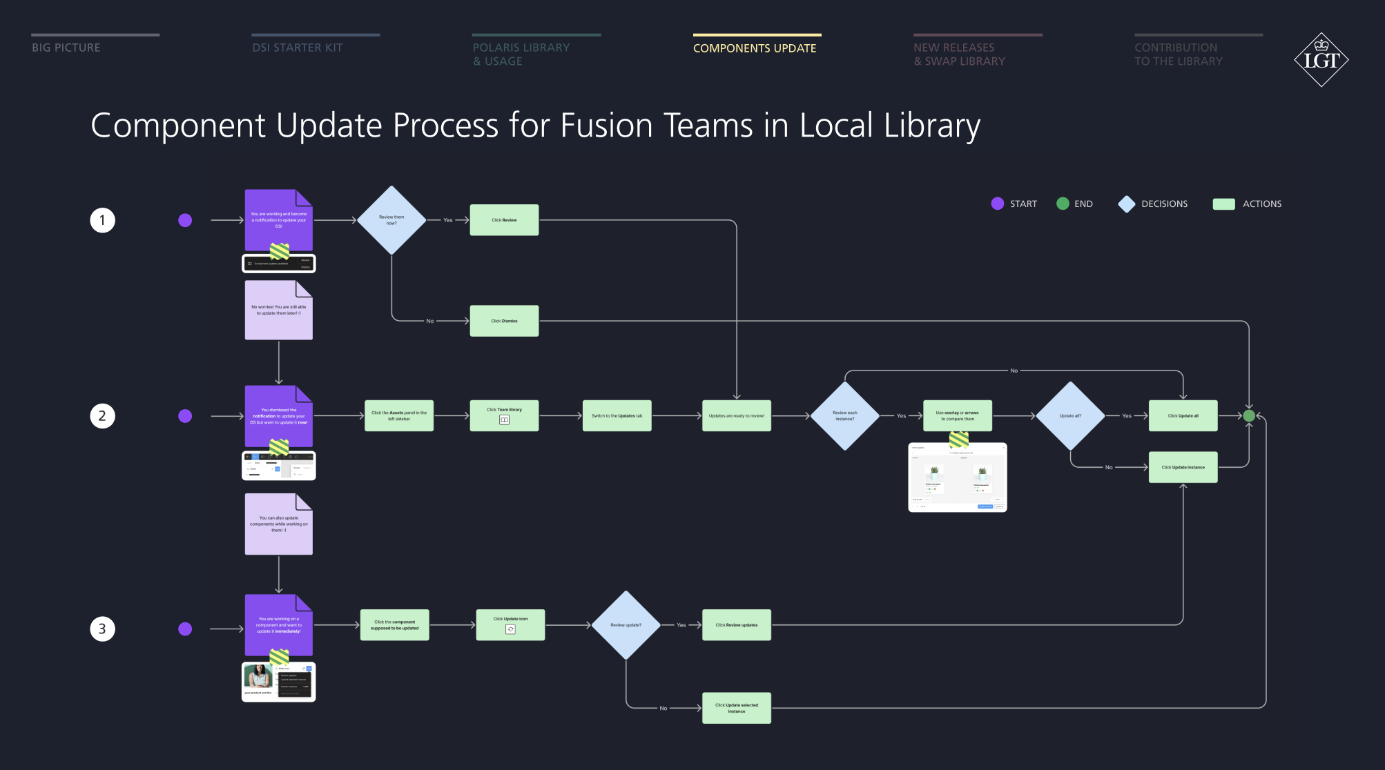
Usage Manual for the Design System
To support adoption across teams, we developed a structured usage manual in Figma, outlining library access, contribution workflows, component updates, and documentation standards. The manual served as a practical onboarding and governance guide for designers and developers working within the Polaris ecosystem.
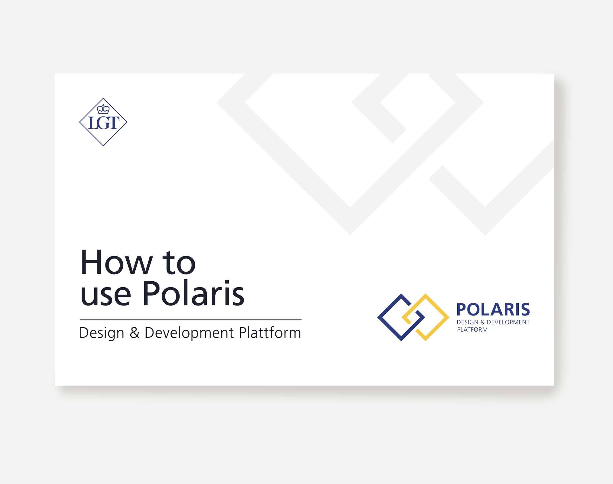
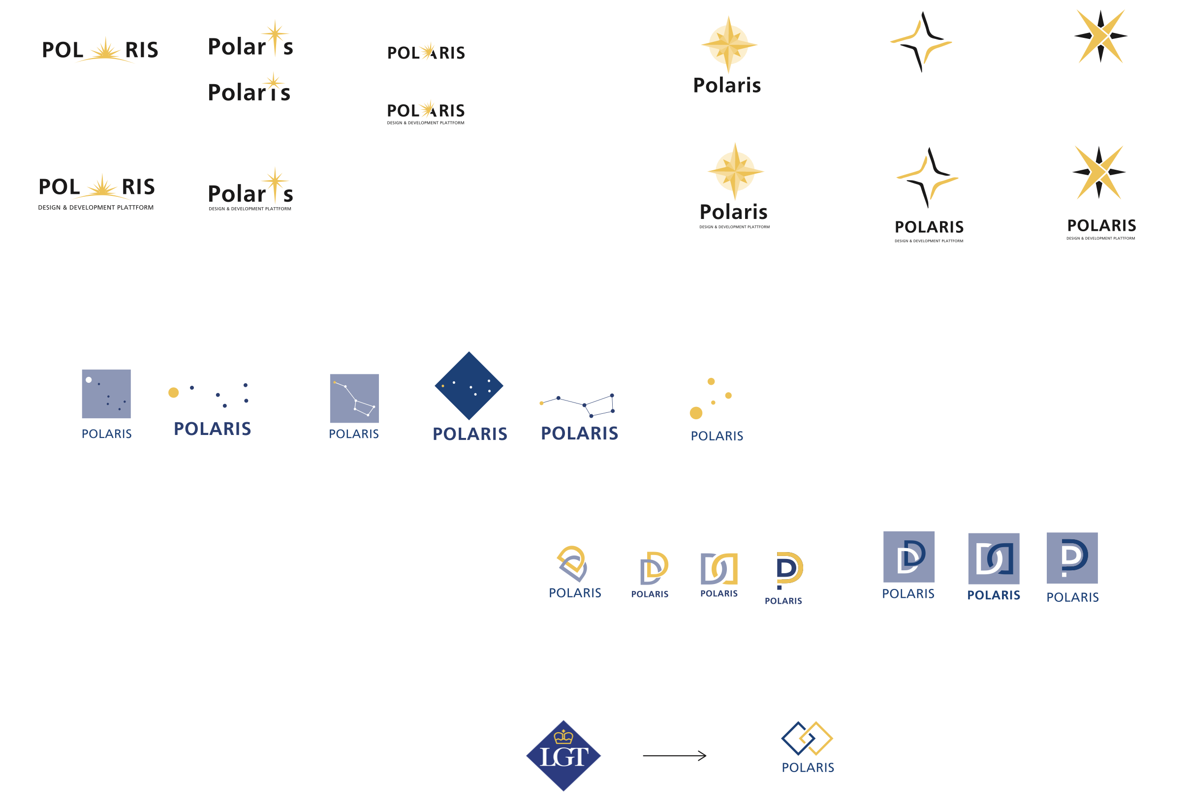
Polaris Logotype
As part of the initiative, I developed the naming and visual identity for the design system, “Polaris” — symbolising orientation, clarity, and alignment across teams. The logotype and visual language were designed to integrate seamlessly with the LGT brand while establishing a distinct identity for the internal design platform.
Conclusion
This project demonstrates experience in enterprise-scale design system development within a regulated banking environment — focusing on structure, governance, component standardisation, and cross-functional alignment.