
ARNETTE E-COMMERCE CONCEPT
ARNETTE is a part of the worldwide eyewear brand LUXOTTICA. It concentrates on sustainable production of the sun- and optical glasses. We created an eCommerce website concept proposal for Arnette. The project was a part of the UX Design Master’s Programm at the Talent Garden School.
The Task
What: Build a new Website
Who: Target Group – Generation Z
Why: The existing website was not an eCommerce website
Style & Tone: Streetstyle, bold, diverse, young, sustainable

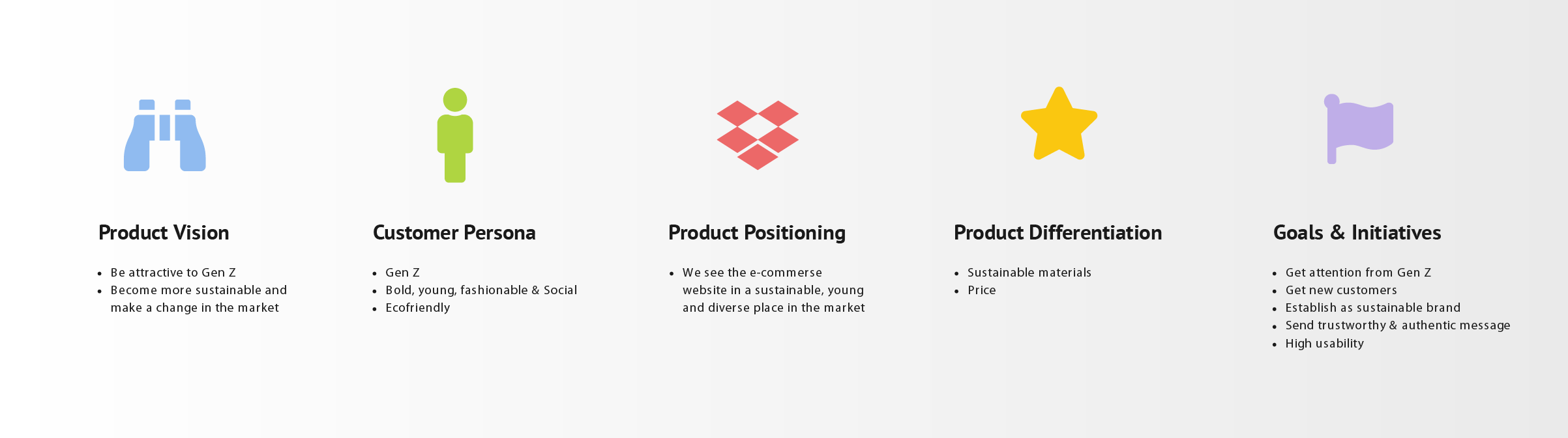
Product Strategy
Problems to solve
The old Arnette site was not an eCommerce website
The website did not appeal to Gen Z
The product purchase was very complicated
Not all products were sustainable
The social media profile and the website didn't correspond with each other
Project Goals
The goal of this project was to design an appealing eCommerce website, that caters to Gen Z, attracting them to purchase Arnette's eyewear
High usability, fast check-out and create a great online shopping experience
Draw the user's attention to the sustainable products
Integrate interactive Features
THE PROCESS
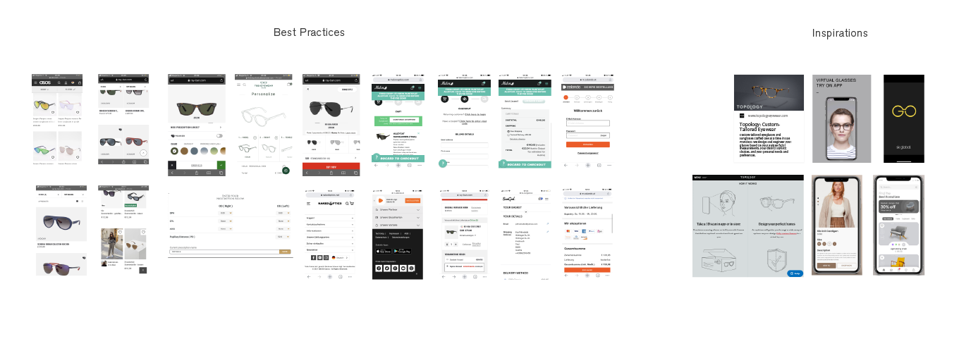
Research & Competitor Analysis
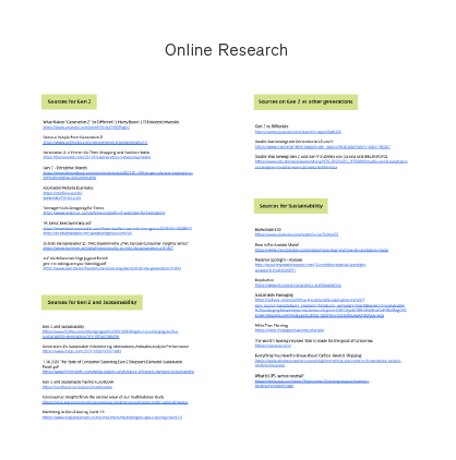
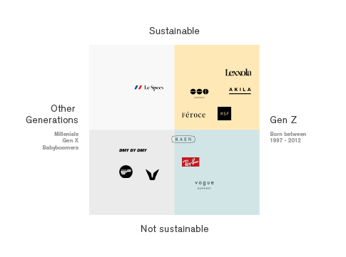
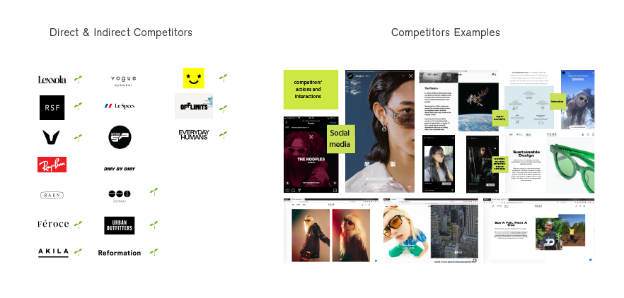
We made a Research on the Users (Generation Z - the target group) and the Market. We made a Competitor Analysis and looked at the Best Practices. Based on our research we came up with the guidelines and a questionaire for the interview. The Research and Analysis have included:
Online Research, Direct & Indirect Competitors, Examples
The Market Placement
Best Prectices
Inspirations & Ideas
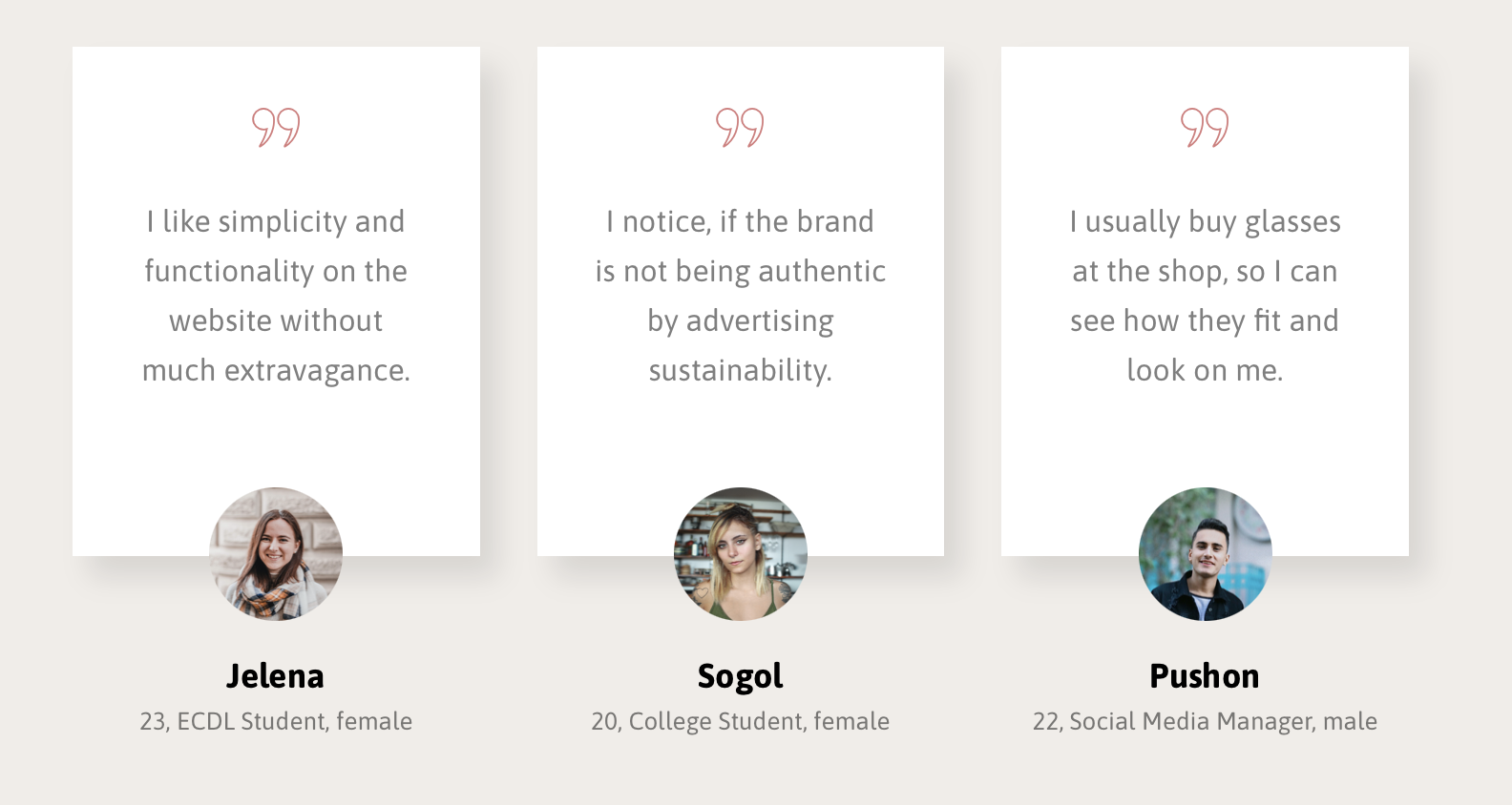
User Interviews
User Interviews
We conducted 3 interviews on Zoom (due to the Covid situation) for about an hour each with the typical Gen Z represantatives. The interviews were recorded, summarised and analyzed.
TAKE AWAYS: Due to the briefing we started to sketch a desktop website for the client. But after some time, research and the interviews, we have found out that a better approach to the target group would be a mobile website. Since the Generation Z is a mobile first generation that spends a lot of time on the mobile phones and social media. But to proceed a purchase online, they likely use a desktop version of the website, because of a better view of a product. Gen Zs have also a very short span attention unlikely like Millenials or the generatins before. They also don't differentiate between different channels, and expect a seamless connection across all touchpoints and a consistant customer experience.
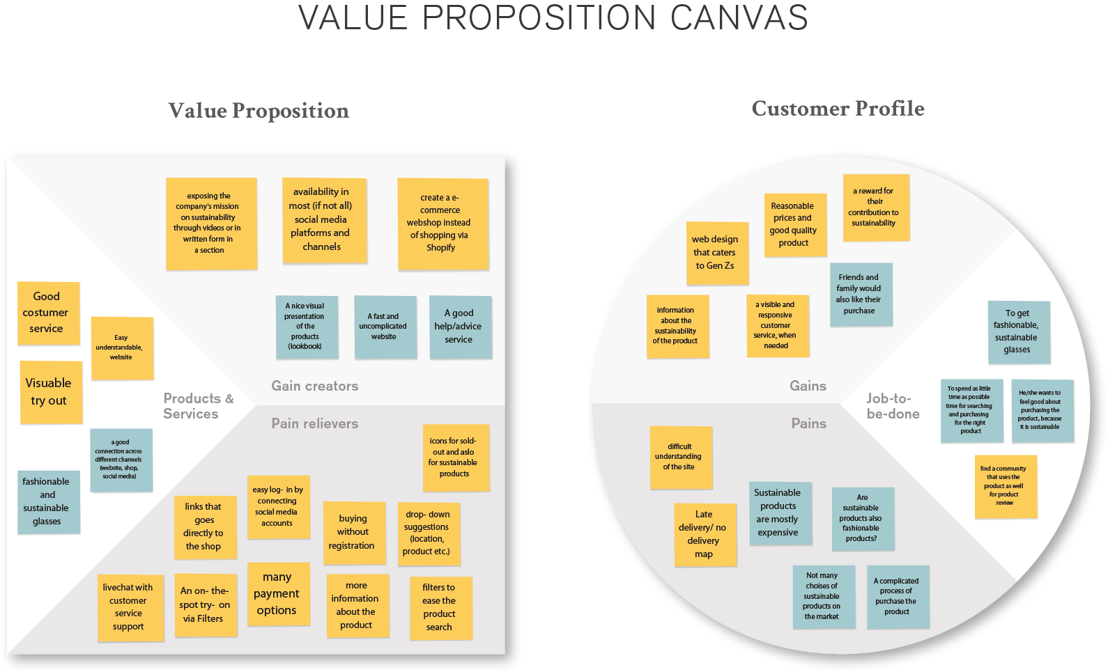
Value Proposition
To focus on the users, we used the Value Prososition Canvas to help us to Empathize with them, to define their Pain Points, Gains and a Job-To-Be-Done to solve the problems they might have. The Design Thinking Process in the development of Arnette website has began.
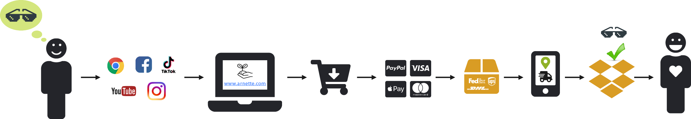
User Scenario
We visualized the typical scenario, and the steps, that the user would go through to fulfill it's task from a wish and the search to the fast check-out.
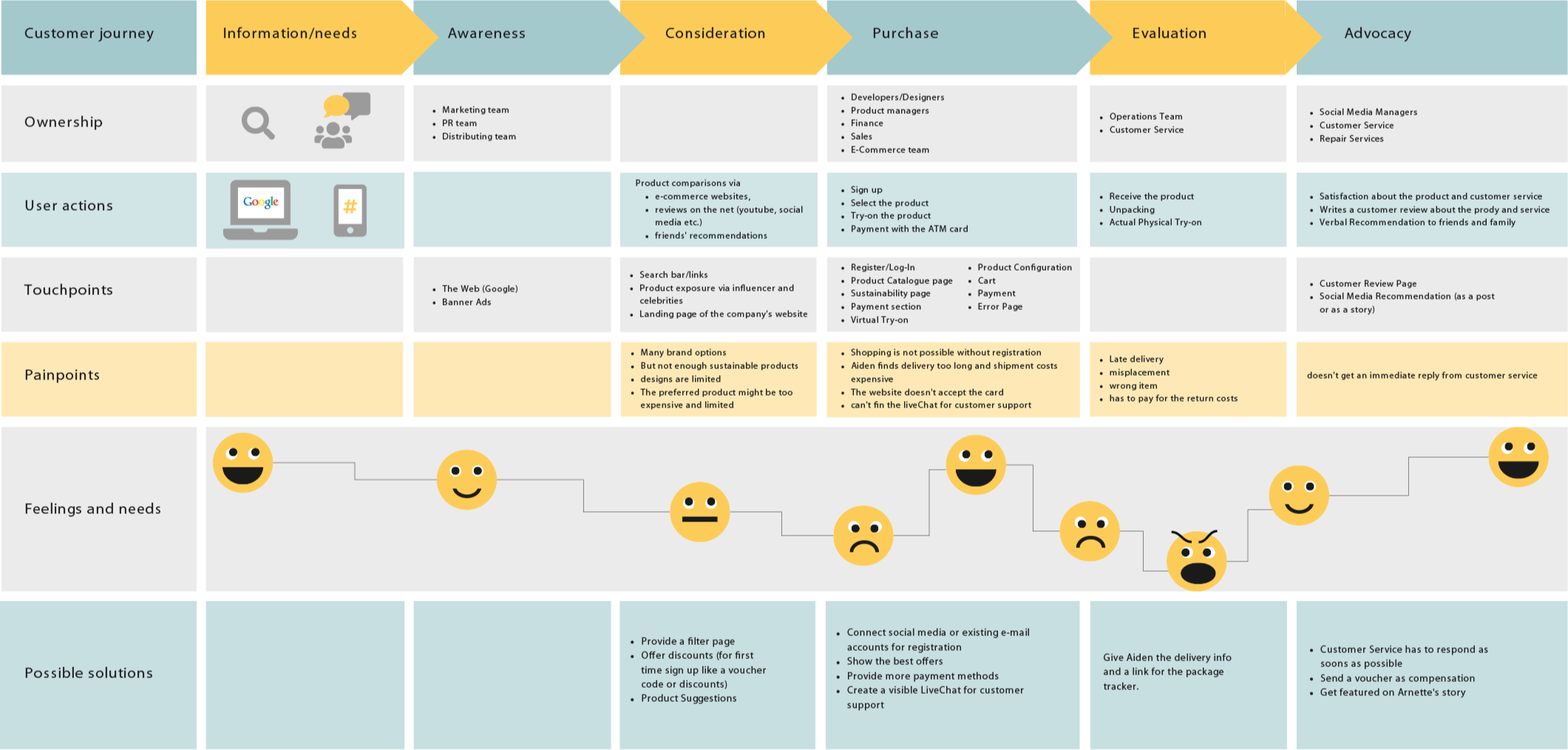
Customer Journey Map
We evaluated the complete sum of experiences that the customers would go through when interacting with the Arnette website and brand, then documented the full experience of being a customer with it's touchpoints, feeling and needs, painpoints and possible solutions.
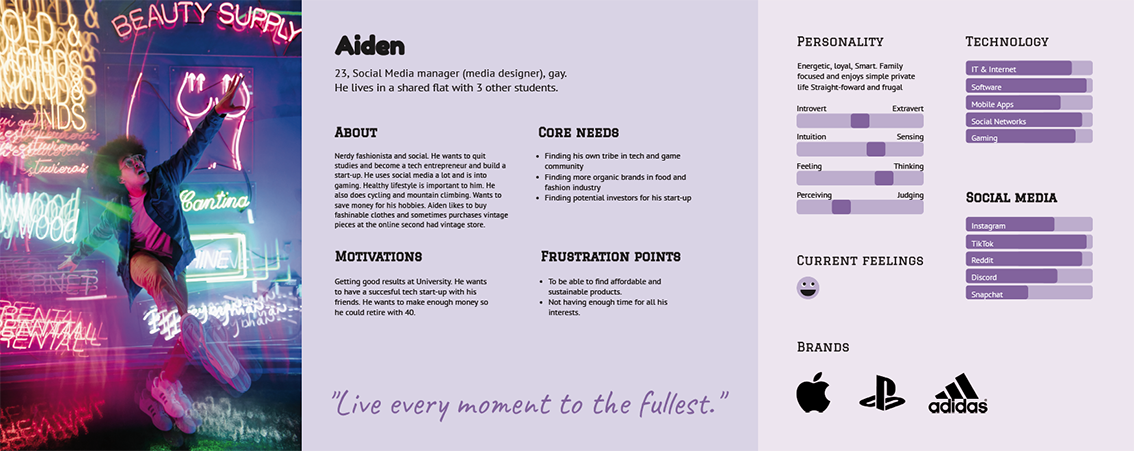
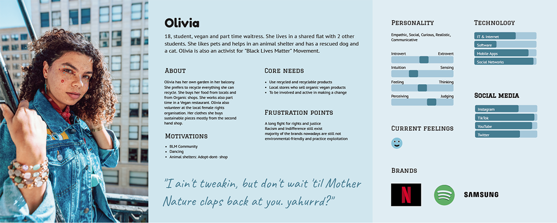
Personas
We introduce Aiden and Olivia. After talking to the users and making the user scenario we created two personas, that due to our research came as close as possible to the real people, who represent the Generation Z and care about the sustainability.
Features
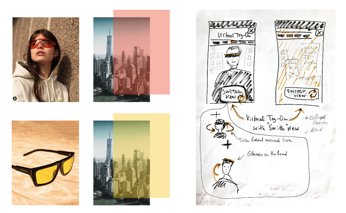
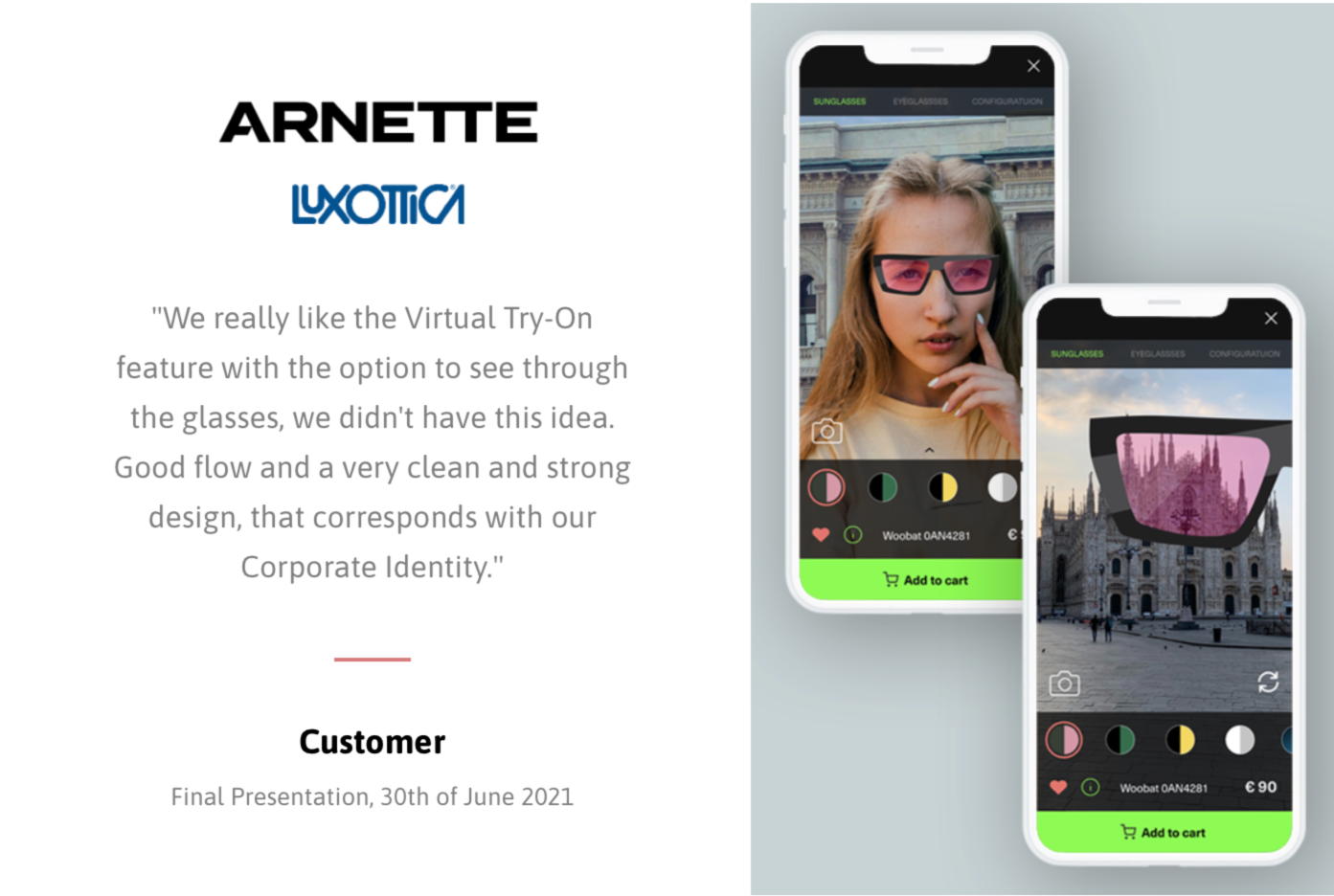
One of the main Features is the Virtual Try-On with the Switch View, that I created by myself. I was wondering how would besides the the sunglasses on myself would the surrounding look like through the bright colored lenses. Through the research I didn't see anything simkilar on the market. So the idea was born. I made a sketch and looked for pictures, that would visualize the idea.
Virtual Try-On & Switch View
What means the customer can vitually try on different pairs of sunglasses, and also switch the camera view to the outside to see through the colored sunglass lenses. In order to help to make a better decision and the best shopping experience for the customer, that it becomes a feeling how it would really feel and look like wearing the glasses.Fast Check-Out
A Fast Check-Out allows a user to go from the Social Media plattform like Instagram to go straight to the payment & check out page on the mobile website.Customization
The customization filter allows the customer to design the glasses by itself, chosing the shapes, frames, lens and colors. The customer would be also able to virtually try on these glasses.Personalisation
For the personalisation there can be an engraved name or text.Lost & Found
This option allows the founder to contact Arnette customer service, that a pair of glasses was found. The customer service would contact a customer, who lost the glasses and if he or she wants to get them back, it would make the arrangement.
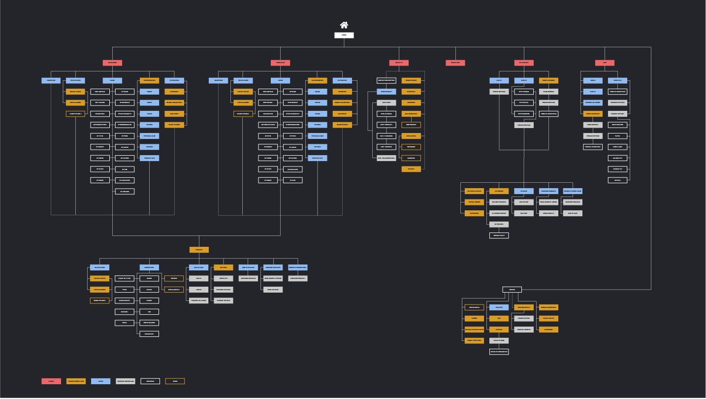
Information Architecture
Site map overview, a detailed construction of the ecommerce website with the product search, with different feautures like virtual try-on, log in and check out.
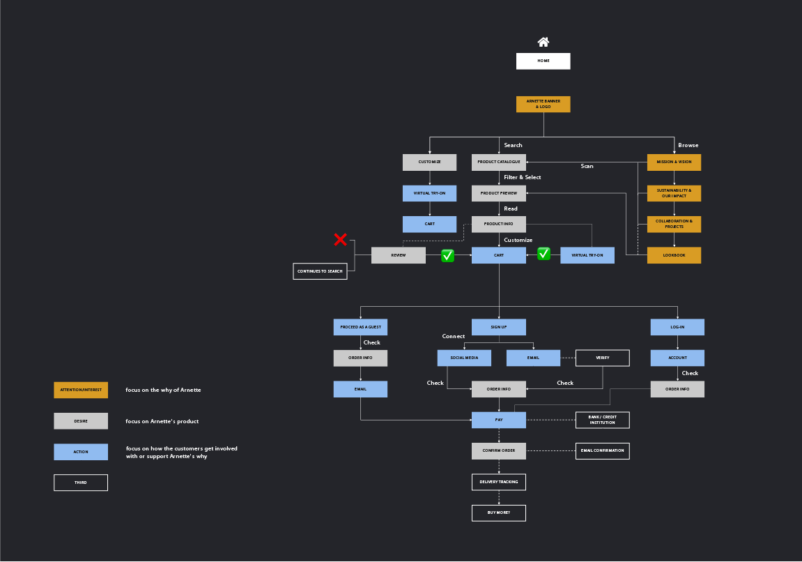
User Flow
An overview, how would the user be able to go from the social media platform to the website, find the right product and make a fast check out.
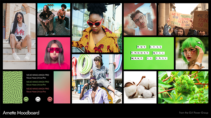
Moodboard
We created a moodboard for the customer including the existing Arnette elements and the bold, diverse, energetic and young style & tone of the Gen Zs.
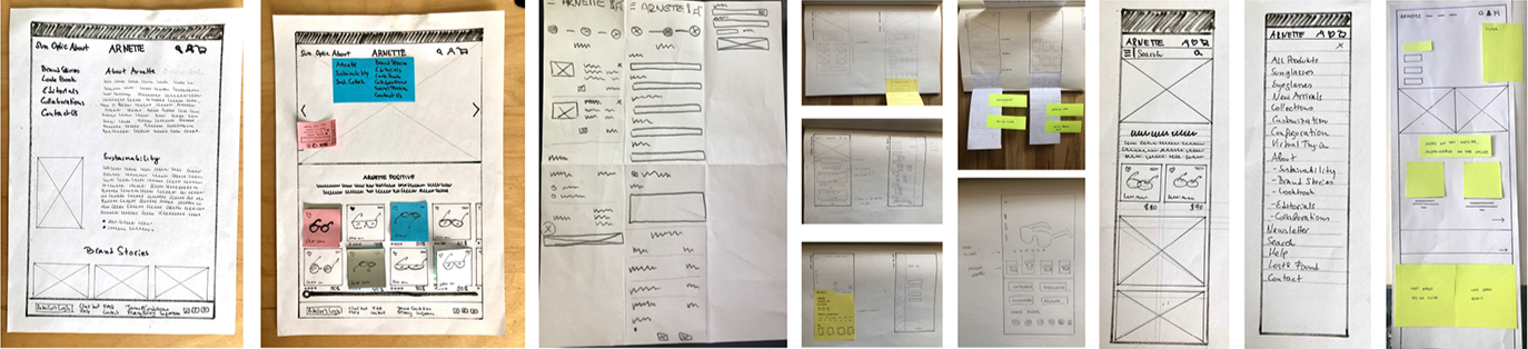
Paper Prototype
A rough concept for the mobile first website with problem solving ideas.
Lo-Fi Wireframes
We created in Figma the Lo-Fi Wireframes, that were already connected, to show the concept the detailed flow.
High-Fi Prototype
THE RESULT
Usability Testing
We carried out a remote the Usability Testing wit 3 participants from out Target Group - Gen Z. After the testing and observing the Users we have summarized all the feedbacks and made several Iteraterations to improve of the Prototype.
Take Aways
The Research, the Observing of the User and the User Testings are very Essential. The Process has taught me, that it is very important to understand the User and it's Needs to make an intuitive usability.
During the methodology, many mistakes can be claryfied and eleminated already on the very early stage of a product development. I also learned, that people might use a product differently, that they think and do things in another way, than me. That is why the Design Thinking is very important. To understand and to apply this Process means to learn and to create a more Human Centered Design.
Customer Feedback
We got a very positive feedback from the client. Especially I was very happy, because the client liked my idea in the Virtual Try-On feature. Luxottica has 40 designers on board, but no one had the same idea, so it was actually a highlight for them and a good feedback for our work.
My role
In a shared team setting, I focused on the following areas:
Concept & prototype of the Virtual Try-On feature
Development of a full landing page + subpages (from paper to high-fidelity in Figma)
Information architecture
UI design
Customer-facing final presentation
Other Group members
Jdhojarra Lainne Arcilla & Eva Prihodszki